Theme sections
Install the LinkSpot Grid Section in your theme to add a flexible, responsive container where LinkSpot app blocks can be placed.
The LinkSpot Grid Section is a Liquid section you can add to your theme that gives you a responsive grid container for LinkSpot app blocks. It lets you build a custom layout (a media-rich product feature grid, a landing page bento, a single full-width media tile) and drop any LinkSpot app block into individual grid cells.
You can find the install instructions and the section files in the LinkSpot admin under Settings > Compatibility > Theme sections.
What it is
The Grid Section is made up of two Liquid files:
-
Grid section (
linkspot-grid.liquid, goes in your theme's/sectionsfolder). The responsive grid layout itself. You configure columns, rows, and gap from the theme editor. -
Grid item block (
_linkspot-grid-item.liquid, goes in your theme's/blocksfolder). A private block that lives inside the grid. It holds a media background (image or video) and accepts LinkSpot app blocks (such as Pin, Annotation, or Product Badge) layered on top.
The leading underscore on the grid item filename is required by Shopify; it marks the block as private to the grid section.
Once installed, the section shows up in the theme editor's section picker, under the LinkSpot sections category, as Media Grid or Single Media.
Why a manual install
The Grid Section is a developer-oriented feature. It requires placing two Liquid files into your theme's folders. LinkSpot provides both files for you to download or copy, but Shopify does not let an app drop files directly into your theme on your behalf. We will however request this feature from Shopify to let us automatically install these files for merchants.
If you are comfortable editing theme code, the install takes a few minutes. If not, send the install steps to the developer or agency that maintains your theme.
For background, Shopify documents how to edit theme code in their own help center: see Edit theme code.
Install steps
-
On the Theme sections page in LinkSpot, click Implementation instructions to expand the install guide.
-
Download both Liquid files, or copy their contents to the clipboard using the Copy code button on each:
-
linkspot-grid.liquid -
_linkspot-grid-item.liquid
-
-
In your Shopify admin, go to Online Store > Themes, find your theme, and open the code editor from the three-dot menu on the theme card.
-
Place
linkspot-grid.liquidin your theme's/sectionsfolder. -
Place
_linkspot-grid-item.liquidin your theme's/blocksfolder. Create the folder if it does not exist. -
Save the files.
Use it in the theme editor
After the files are installed:
-
Open your theme in the theme editor.
-
Add a new section to a template. Look for the LinkSpot sections category in the section picker.
-
Choose Media Grid for a multi-cell grid, or Single Media for a single full-width media tile.
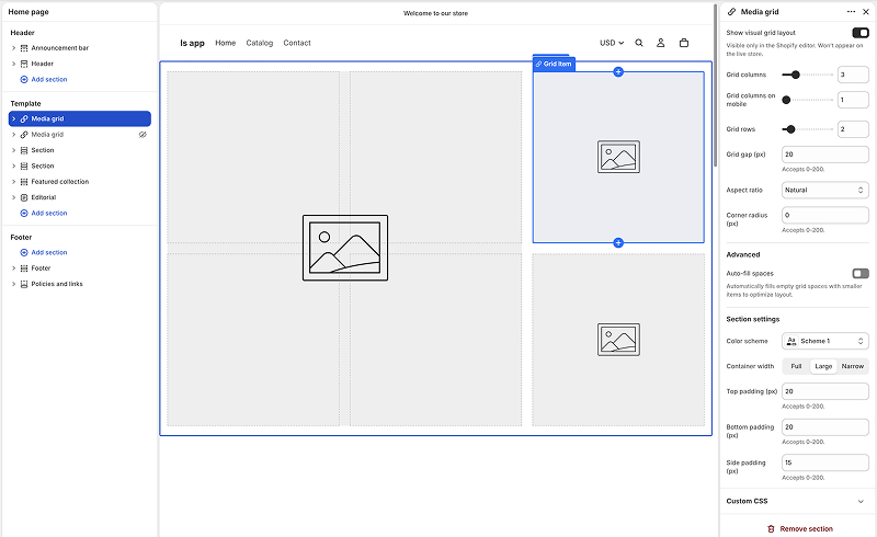
-
Configure the grid (columns, rows, gap) from the section settings on the right.
-
Inside each grid item, add LinkSpot app blocks (Pin, Annotation, Product Badge, Collage, Product Set) the same way you add any other app block.
-
Save the theme.
The grid renders on whichever pages the template is used for.
When to use this
Use a Theme section when:
-
You want to build a custom layout that uses LinkSpot elements as the visual foundation, not as overlays on existing product images.
-
You want a media grid (bento, gallery, feature row) with interactive overlays on each cell.
-
The default placement options for LinkSpot elements (on the product gallery, as a product image replacement) do not fit what you are building.
You do not need a Theme section for the common cases (a pin on a product image, a sale badge on a gallery image, a collage replacing a product image). The default app embed handles those.